Easy Color Combinations for Stampin’ Up!’s Sweet Blooms Bundle
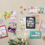


Everyone loves receiving a beautiful bouquet of flowers, but it’s not always possible to send one. Almost as good—and maybe even better!—is the gorgeous array of paper crafts you can create with the right set of stamps, coordinating dies, and the best ink and paper combinations available. These handmade floral cards, scrapbook pages, and other unique paper crafting possibilities can be highly customizable, deeply personal, and incredibly fun to make and send—even if they don’t smell as good as their live counterparts.
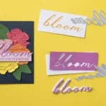
The Sweet Blooms Bundle from Stampin’ Up! makes it easy to design and create flower-themed papercrafts, particularly when you’ve got beautiful color combinations for crafting at your fingertips. Sometimes it can feel overwhelming with so many disparate products on the market, but with these easy color combinations for the Sweet Blooms Bundle and the coordinating products from Stampin’ Up! you’ll have no trouble whipping up gorgeous designs to send to loved ones or keep in your own scrapbooks for generations to enjoy (with zero petals wilting along the way)!
Why the Right Color Combination Makes All the Difference

While we can appreciate the creative use of color in unexpected ways, we love the idea of keeping your floral stamp set color ideas as close to nature as possible. There’s just something about reflecting the realism of flowers that makes for an elevated end product! Choosing the right color combination in any situation is important, but particularly here using natural colors—even the bright ones!—will invite a sense of calm, comfort, and even celebration.
When thinking about color combinations for the Sweet Blooms Bundle, consider using these shades for different parts of the card or scrapbook page layout:
Petals
- Pinks: Pretty In Pink, Melon Mambo, Strawberry Slush
- Oranges: Calypso Coral, Timid Tiger, Cajun Craze
- Yellows: Crushed Curry, Lemon Lolly, Darling Duckling
- Purples: Gorgeous Grape, Blackberry Bliss, Highland Heather
Foliage + Stems
- Greens: Mossy Meadow, Granny Apple Green, Shaded Spruce
- Teals: Pretty Peacock, Coastal Cabana, Summer Splash
- Browns: Pecan Pie, Early Espresso, Crumb Cake
Backgrounds
- White: Very Vanilla, Basic White
- Deep greens: Mossy Meadow
- Light Blues: Balmy Blue
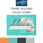
Best Color Combinations for the Sweet Blooms Bundle
In designing the Sweet Blooms Bundle, the idea was to embody the concepts of friendship and kindness, all wrapped up in pretty flowers and sentiments of encouragement. The photopolymer stamps and coordinating dies are perfect for any number of occasions and simple thinking-of-you messages, adding some pollinated positivity to your paper crafts! All that to say, our favorite color combinations for the Sweet Blooms Bundle reflect those ideas and help bring a bit of earthy energy and comfort to your cards, scrapbook pages, home art, and more.

You’ll find that most of these particular papercraft color palette ideas include at least one of the following exclusive Stampin’ Up! shades:
- Strawberry Slush: A petal-perfect coral
- Timid Tiger: A slightly muted but true orange
- Darling Duckling: The ideal sunshine yellow
- Granny Apple Green: A tart leaf-green
- Summer Splash: An energetic teal
- Secret Sea: A deeply-saturated blue-green
- Petunia Pop: The happiest fuschia
As a foundation, these colors work well to bring each part of the Sweet Blooms Bundle together—from stem to stamped sentiment. Check out some of the best color combos for crafting using this charming stamp and die set below!
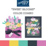
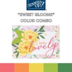
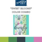
What better place to start than with a sweet rainbow of floral and foliage shades? But this Sweet Blooms Bundle color combination for crafting is better than basic—it beautifully balances each color for a vibrant yet inviting intro to this bundle’s possibilities.

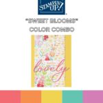
This bright color combination for the Sweet Blooms Bundle feels like a candy-coated summer afternoon, perfect for a garden array of florals and complementary embellishments.

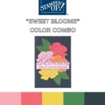
Without leaning too far in, this rich color palette feels a bit like fall. By making orange the foundation of the card, it gives pumpkin without feeling like a jack-o-lantern, and still lets the lovely floral papers have their moment in the sun. Top it all off with a Petunia Pop’d “lovely” die cut and your card is exactly that!

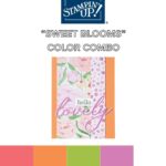
One of our favorite things about these color combinations for the Sweet Blooms Bundle is how incredibly versatile they are depending on where you choose to put emphasis! Allowing different colors to shine through in your paper craft execution will make all the difference as seen in this moodier color palette.

(We love a Secret Sea moment—and just look how much depth and drama is added by using all those cleverly designed die cuts and Designer Series Papers!)

Speaking of Secret Sea, why not dive straight into the greenery with this lush color palette, perfect for letting those pretty purples pop! Don’t be afraid to embrace all those greens and teals—analagous colors are to die for…but more on those in the next section!

This enchanted garden color palette is such a dream. And though there are many colors playing quietly in the background, these 5 get all the glory—and rightly so! They combine the cool and the charming for the perfect blend of floral bliss.

This floral stamp set color idea is reserved for only the moodiest of blooms. That deep blue-green backdrop is the secret to a mature, yet fresh bouquet bursting from the paper!

This last color combination for the Sweet Blooms Bundle is almost reminiscent of the sea itself! Letting that happy teal take center stage, the other colors serve to emphasize the refreshing hue while making space for some happy orange blooms, too.

Tips for Choosing the Right Ink and Colored Paper for Crafts
The best ink and paper color combinations follow some basic rules of color theory. Different colors work together, balance each other, or even fight for attention if not paired properly. So let’s quickly refresh some of the foundational color-coordinating strategies.
Monochromatic Colors
Monochromatic colors are easiest to coordinate as they’re simply plays on one main color. After choosing your focal color, you take the lighter and darker versions of it for a trio of chic hues that match perfectly every time.
Analogous Colors
Analogous colors are also easy to find in that they’re right next to each other on a color wheel. They create a nice harmony with a bit more depth than monochrome palettes might offer.
Complementary Colors
Complementary colors are found directly across the color wheel from one another, making them the ideal ‘opposites attract” kind of pair. They are often fun combinations that celebrate a purposeful contrast.
Triadic Colors
These are three colors found equally spaced from each other on the color wheel. The most famous are, of course, our primary colors of red, yellow, and blue, but plenty of color adventures are waiting to be found just a few turns away from those basics!

One of the things that can make creating your own color combinations incredibly simple is the handy Color Coach from Stampin’ Up! This dynamic color wheel uses tried and true art and science to determine which colors will work great together—and the best part? It’s specifically designed for Stampin’ Up! crafters so you know exactly which colors of ink and paper (even the pretty designer stuff) to purchase!
Another way to keep things simple when looking for papercraft color palette ideas is to purchase them in already-coordinated packs. With Stampin’ Up!, it’s easy to find an embellishment sheet, paper pack, or marker set that can guide you through any color choices in your crafts!
Make Your Papercrafts Blossom With The Sweet Blooms Bundle
Ready to try your hand at crafting with these fun and easy color combinations and the Sweet Blooms Bundle? Get shopping at Stampin’ Up! today! Or if you’re looking for a bit more inspiration before you begin, why not check out our Instagram page or contact a Stampin’ Up! demonstrator today!