Refreshing Summer Color Combinations for Cards and Scrapbooks
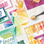

Finding a summer color palette for your next handmade card or scrapbook page layout is a great way to bring vibrancy and life to your crafts! Often these summer colors reflect the qualities we associate with the season itself: light, fun, nature, happiness, and refreshment, which means they’re perfect for capturing all your favorite summertime memories, too—think backyard barbecues, pool days and afternoons at the beach, a much-awaited vacation or road trip, and time spent in your favorite nature spots. The best summer color combinations also work well to evoke those exciting sunshine vibes in all your summer card ideas and other crafting projects.
So how do you know which colors work well together and which combinations are really going to bring that sweet summertime mood to your papercrafts? First, you can never go wrong by arming yourself with some simple color theory from the pros at Stampin’ Up! Next, keep scrolling to find 9 gorgeous summer color palettes sure to capture the best parts of this season on paper.
Summer Color Palettes to Try in Your Next Card or Scrapbook Project
Whether you’re using plain cardstock, beautifully-designed patterned papers, inked stamp imagery, markers, ribbons, or other embellishments—or a combination of all the above!—these 9 pretty palettes are going to pair the vibrant energy of summer colors with your handmade crafting projects.

The basics of color theory remind us that colors speak to us subconsciously. They evoke different types of emotions and energy, depending on their use and pairings. And if you’re not sure where to start, we love grabbing inspiration from photos taken during the event you’re scrapbooking or ones that match the mood of the DIY card you’re making for a loved one. Find clever examples in each of the categories below!
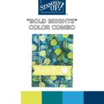
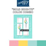
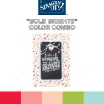
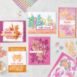
Bold Brights Color Combos
Bold bright colors simply shout that classic summer feeling! Whether you’re celebrating a summer birthday, memorializing a family vacation, or sending out invites to your annual block party, these vibrant hues reflect that sunshine feeling we all know and love.
Our first summer color palette harnesses all the freshest shades of blue and green, invigorating this handmade card with all the natural vibrance it can possibly contain. Utilizing the perfect floral paper and a pop of white in the matching embossed stamp image, this DIY card design feels like revitalization itself.

Some of the best summer color combinations are the most playful! We love this perky twist on the primary colors, with a pop of pink to really make a sweet splash. And don’t forget, each one of these summer color palettes can be easily expanded to include various shades or tints of the same hue. Check out those balloon stamps, shaded with colored pencils to add dimension and depth to the shape as well as the color scheme.

Our last bold and bright summer colors for crafts are the most daring, too—absolutely unapologetic in sending their message loud and clear: it’s time to celebrate! Using both triadic and complementary colors, this combo is clamoring to be used in a mini summer scrapbook album or as the palette for your next craft club get-together.

Want to know which other Stampin’ Up! colors work perfectly in your own bold and bright summer color palettes? Try papers and ink in shades like:
- Melon Mambo
- Strawberry Slush
- Timid Tiger
- Pumpkin Pie (Don’t make orange a fall exclusive! Paired with turquoise or a rich magenta, you’ll be in for a summer treat.)

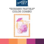
Summer Pastels Color Combos
While some might think that “summer pastels” is an oxymoron, we love a subtler take on the bold and beautiful hues of the season. After all, not every sunshine moment needs to shout! We’re thinking that baby and toddler scrapbook color schemes, dreamy wedding thank-yous, and even your own private scrap-journaling sessions deserve some summer love—just a shade quieter than maybe we’re used to.
Don’t be surprised by this first pastel palette, as at first glance it appears pretty saturated! But check out how this celebratory card is executed with lightly colored stamped images and plenty of white space to let those delicious summer shades soak in—proof that nearly any summer color palette can become pastel if you want it badly enough.

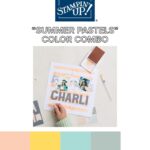
We love the clean look of this next summer color scheme with its yummy peachy focus, allowing subtle pops of yellow and turquoise to really make it come together. And the technique of painting on white paper to achieve the exact depth of color you want for your papercraft project? Absolutely genius.

Next up is a summer pastel combo that makes our childhood hearts sing! Combining a number of colors that may not make sense in your head but have just enough whimsy on the page to work—sign us up!

While checking out the Stampin’ Up! Subtles collection is a great way to guide yourself to creating more summer pastel palettes you’re sure to love. May we suggest a few more favorites to consider?
- Very Vanilla (Such a chic take on classic white that’ll make your pastels feel thoughtful and demure.)
- Bubble Bath
- Lemon Lolly (Subtle but mouthwatering citrus popsicle vibes you’re gonna love!)

Nature-Inspired Color Combos
Ah, nature—our favorite source of inspiration for color palettes of any season, but especially summer! How can you beat the verdant greens and clear sky blues our world has to offer? Well, combine them with a few more earthy hues and you just might be in for a solid summer color palette you’ve only ever dreamed of. Try using these combinations to add sophistication, and even sometimes masculinity, to your memory page layouts, gratitude cards, and more!

First up in our nature-inspired summer colors for crafts is this pretty little floral number. Using varying shades of green and purple, two perfectly suited nature hues, this sweet thank you card pops off the white background without a lot of fanfare but plenty of natural impact.

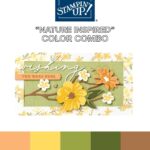
Warming up with some rich yellows and oranges, this summer color palette is earthy, cheerful, and sophisticated all at once. One great rule of thumb you can follow is if it appears in nature, it’s going to make a great addition to your summer card ideas—Mother Nature doesn’t make mistakes!

Adding a bit more dynamic color palette to our nature-inspired theme with this one! Using a hue you might typically associate with pool parties (aptly named, yes?), we’re actually headed on something of a nature retreat, finding space in the mountains for this fan-favorite turquoise. Combining it with the grounding greens and a pop of orange keeps things just as interesting as your preferred hiking trail.

Want a few more shades to play with when creating more summer color palettes inspired by nature? Check out these natural wonders!
- Highland Heather
- Misty Moonlight
- Early Espresso
- Secret Sea (The dreamiest shade of deep green you’ll ever find!)
- Petunia Pop
Refresh Your Summer Paper Crafts with Stampin’ Up!
Ready to play with your new favorite color combinations inspired by a refreshing summer? Shop gorgeous colors of cardstock, markers, and more at Stampin’ Up! or contact a demonstrator to learn more about the best summer color combinations today!