Monochrome Fall: Single-Tone Color Schemes for Autumn Crafts


Color is a powerful tool of communication—it can influence emotions, focus attention, and set a mood. From the bright florals of spring to the earthy tones of autumn, choosing the right color combo for your seasonal craft projects can help you convey the feelings each season evokes.
Autumn is characterized by rich, earthy tones inspired by fall foliage—think deep reds, mustard yellows, mossy greens, and golden browns. You can draw on all of these colors to create a classic fall color scheme. Another approach is to use a monochrome color palette. This uses variations of a single base color to create a harmonious palette. Monochrome color palettes are a perfect choice for autumn because they mimic the course of the season with bright colors fading into muted tones.
FOUR MONOCHROME COLOR PALETTES FOR STUNNING AUTUMN PROJECTS
To help get you started on your next autumn craft project, we’ve curated some monochromatic color palettes that are perfect for fall.
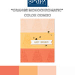
BURNT ORANGE MONOCHROMATIC COLOR PALETTE
This fall color scheme draws inspiration from varying shades of autumn leaves. It combines the vibrancy of orange with subtle infusions of other tones for a rich, earthy quality. Try using it on your next DIY card design, like the example below, or on a scrapbook page when you want to capture fun seasonal memories.

AUTUMN BROWN COLOR SCHEME
A warm brown monochromatic color scheme is ideal for rustic craft projects and decor. From name cards for your Thanksgiving table to banners and decor, this single-color palette is filled with warm neutrals for a minimalist look.

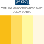
MUSTARD YELLOW MONOCHROMATIC COLOR COMBO
While yellow is commonly considered a spring color, it can also be used as a bright autumn color. Deep mustard yellows evoke the warmth of autumn leaves, harvests, and the cozy atmosphere of the season. Try using this minimalist fall color scheme for autumn gift tags and homemade cards.

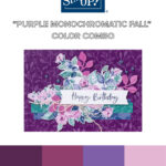
RICH PURPLE MONOCHROMATIC COLOR SCHEME
Deep, earthy purples are perfect colors for autumn—think changing leaves or grapes ready for harvest. These deep fall tones are perfect for DIY projects that you want to give a warm, elegant feel.

TOOLS & TECHNIQUES TO MAXIMIZE A MONOCHROME LOOK
Whether you’re using one of the fall color schemes above or want to get creative on your own, understanding how colors interact with each other can help elevate your crafting skills. To help you gain confidence in this area of your crafting, Stampin’ Up! created the Color Coach. This color wheel helps users identify basic information about our colors, so you can let your creativity soar.
Using various tones of a single color for your next craft project can create a minimalist feel that also helps draw the eye to elements such as text, textures, and images. Here are some tools and techniques you can try to help maximize your monochrome look.
CREATE MONOCHROME PROJECTS WITH INK AND PAPER
If you want your stamp designs to move from dark to light, you can use the generational stamping technique. To do this, apply ink to a stamp and press it on the paper multiple times without reinking between uses. The intensity of the color decreases each time the stamp is used, and the image takes on a lighter tone, creating a monochrome effect that will complement your color scheme of choice.
The example below features “color buddies”, which are colors in the same hue but different shades. Calypso Coral is a color buddy to Petal Pink. The card example was achieved with tone-on-tone stamping, so the stamped image on Petal Pink cardstock was done with Petal Pink ink. The same applies to the Calypso Coral and Peach Pie sections of the card.

USE POPS OF COLOR AND TEXTURE
Using a single-color palette as a base and then adding pops of color and texture can create a sophisticated look for your next paper craft project. The example below does exactly this. The foundation of the card uses Early Espresso to create a warm autumn feel. This is layered with designer paper in the same shade to create depth. Finally, die-cut leaves in deep fall tones bring a bit of sophistication and elevate the seasonal feel of the craft.

USE TWO-TONED CARDSTOCK TO CREATE DEPTH
The best part about using a monochromatic color scheme is that it simplifies your project, creating a clean and minimalist look. When you only want to use one color but you still want to create depth in your project, try using Stampin’ Up! two-toned cardstock. This cardstock is two-sided with shades of the same color on each side. The example below uses two-toned cardstock to layer and create depth between each of the different design elements.

OTHER TOOLS & TECHNIQUES TO TRY
There are many ways to create visual interest while crafting. Try one of these tools or techniques to make your next monochromatic craft project pop:
- Ink blending
- Embossing
- Layering die cuts
- Metallic embellishments
- Scoring
- Crinkling paper
- Stampin’ Spritzer
- Fussy Cutting
DISCOVER OTHER MONOCHROME FALL COLOR COMBOS WITH A FRIEND
Hopefully, the minimalist fall color schemes in this post provided the inspiration you needed for your next autumn craft project. But don’t get discouraged if you need more direction. We have an amazing community of crafters who are eager to help. Contact a Stampin’ Up! demonstrator today and get crafting with a friend!