Color Coordinating 101: Everything You Need to Know
When you add the word “theory” to any phrase, it can suddenly feel a bit intimidating—like it really requires an in-depth study to truly understand its complexity. Maybe that’s true, but when it comes to color theory and how it relates to color coordination in crafts, we’re here to demystify the topic and make combining colors while cardmaking and scrapbooking as simple as possible.
As defined by the Interaction Design Foundation, “color theory is the study of how colors work together and how they affect our emotions and perceptions. It’s like a toolbox for artists, designers, and creators to help them choose the right colors for their projects.”
What a great toolbox to have when you’re creating beautiful paper sentiments for your loved ones! Let’s dive a little deeper into color theory in crafting, how to work with monochromatic, complementary, analogous, and triadic color schemes and some practical tips for crafting with color. Plus, we’ll reveal the answers to frequently asked questions about color coordinating in crafts and give examples of the best color combos for cards, so make sure to bookmark this page for future reference!
Understanding Color Theory in Crafting
Understanding color theory in crafting means we need to take a closer look at basic color theory as well as the color wheel. Then, we’ll dive into how to use them both in order to find the best color combinations for any craft project you’ve got up your sleeves.
Basic Color Theory
The basis of color theory is the belief that color is important and that individual hues, color values, and saturation levels affect the mood of a visual. That color itself evokes a range of emotions in human beings.
Certain colors just seem to work better in certain scenarios—brights for birthdays and neutrals for condolences, for example. Colors really are an influential communication tool! Many scientific studies have shown that we have a natural emotional response to various hues. So, how does that relate to colors in crafting?
Well, if we understand that red is often a stimulating color associated with energy, power, or passion, we probably won’t choose to use it as a foundational color in a card welcoming a new baby. A color connected to calmness (blue) or joy (yellow) may be a more fitting choice. That said, a nice red could work well in a congratulatory card for a friend who’s recently been promoted. The color better suits the emotions of the situation being celebrated.
While you can always dive deeper into what each color means in our culture, you can often simply trust your gut. Humans react to colors a certain way because of our scientific makeup, not because we’re told to do so. So, if instinct says that turquoise is the way to go when creating a thinking-of-you card for a specific friend, you’re probably right!
Now, things do get a bit more complex when coordinating colors in crafting. Let’s learn a little more about the color wheel to further our understanding of what good color combos might look like.
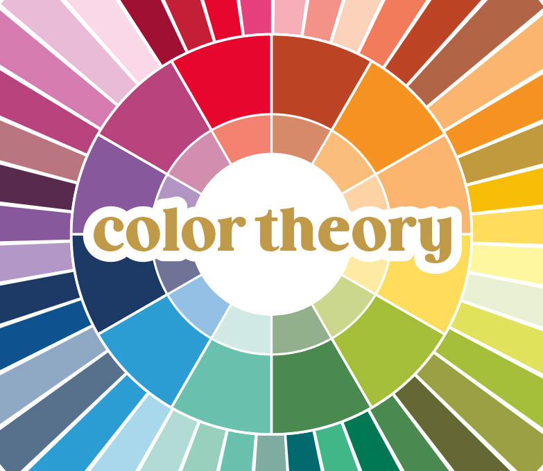
The Color Wheel
The color wheel is the perfect tool for figuring out how to mix colors in crafting. But what exactly is it?
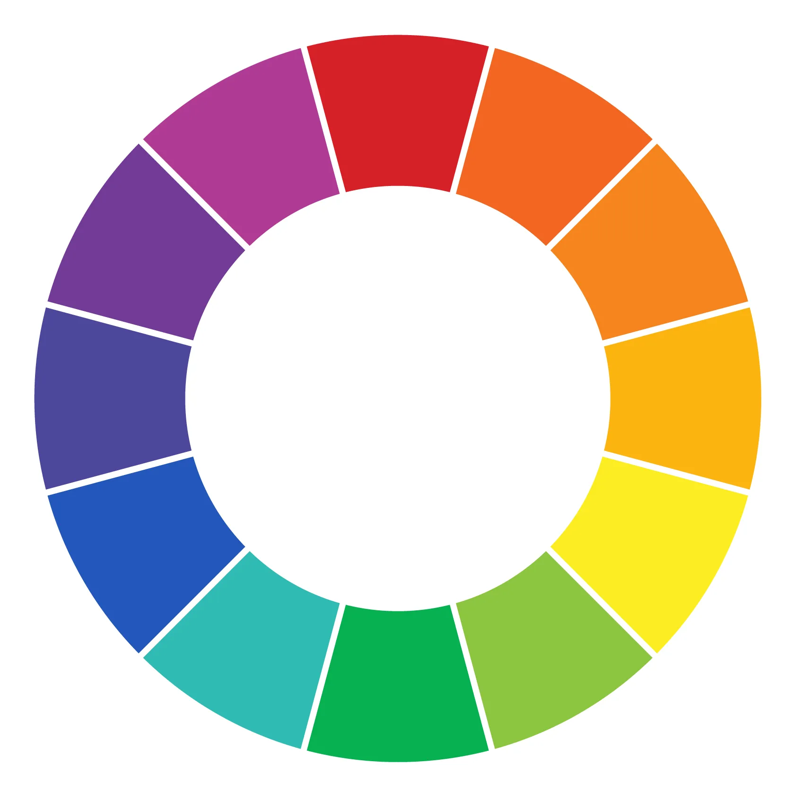
The color wheel is a visual diagram that represents the visible spectrum of light. The colors are organized into a wheel where the ‘final’ color meets again with the initial one in a strategic gradient, forming many key visual relationships throughout. Viewing colors like this makes it easy to coordinate colors in crafting as long as you know some important strategies.
Color Coordinating Strategies
There are several ways to look at and utilize the color wheel for color coordination. For example, you’ll notice that the wheel above can be split in half between the violet and fuschia, then across the wheel, and down between the yellow and green wedges. That will effectively divide the wheel into what are known as the warm (upper right) and cool colors (lower left). If you cover the warm colors now using a piece of paper or your hand, can you see how all those cool colors look as though they belong in a family? This means that they can play well together as good color combos in scrapbooking and paper crafting.
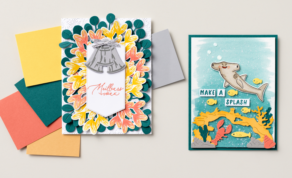
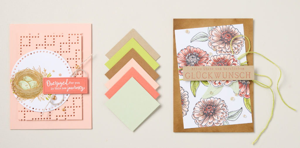
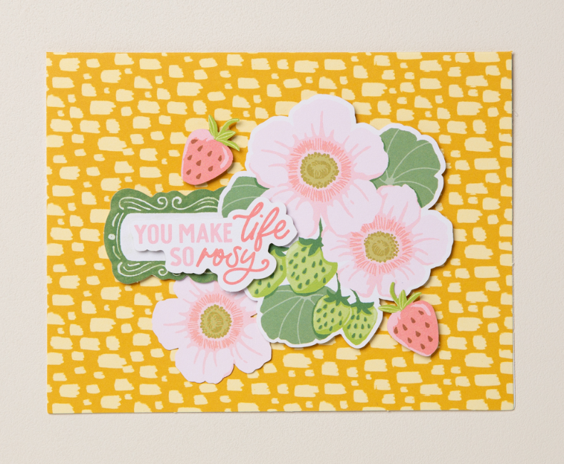
But the possibilities don’t end with simply warm and cool color families. Let’s talk about how to find and use monochromatic, complementary, analogous, and triadic colors in your cardmaking. Here are some examples from the Stampin’ Up! Annual Catalog:
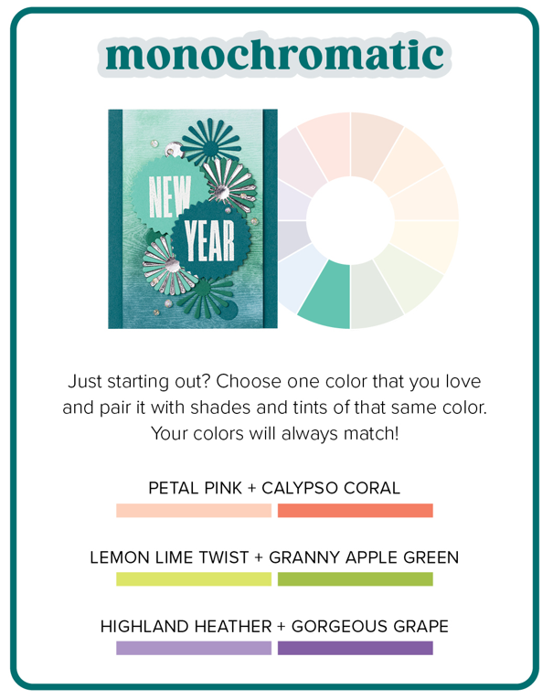
Monochromatic Colors
Monochromatic colors are one of the easiest to work with in crafting projects. To start a monochromatic card design, simply choose a color you love from the color wheel and then pair it with another shade or tint of the same color that’s a bit darker or lighter (or both!). This color coordination technique makes for perfectly matching paper projects every time, plus it comes across as chic and tastefully understated.
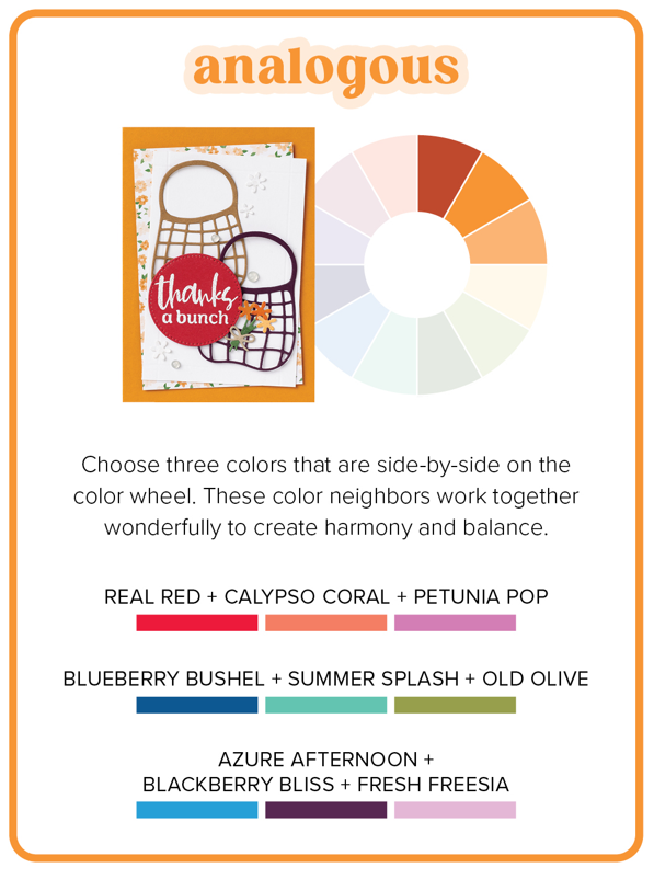
Analogous Colors
Ready to drift a little further from the single-hued design of monochromatic colors? Try analogous colors, which are found by combining one color with its closest neighbors on the color wheel. By choosing analogous colors for your card, you’re ensuring a look of cohesion and harmony, as these combinations are known for their calming effect in artistic design.
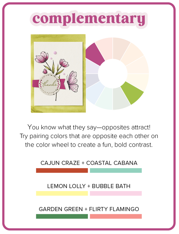
Complementary Colors
Complementary colors are the first ones that offer a real pop in art and design. While you find them in directly opposite positions from one another on the color wheel, these color pairings prove that opposites attract. They brighten each other’s effect in bold but friendly contrast. Complementary colors add energy and vibrancy to any crafting project.
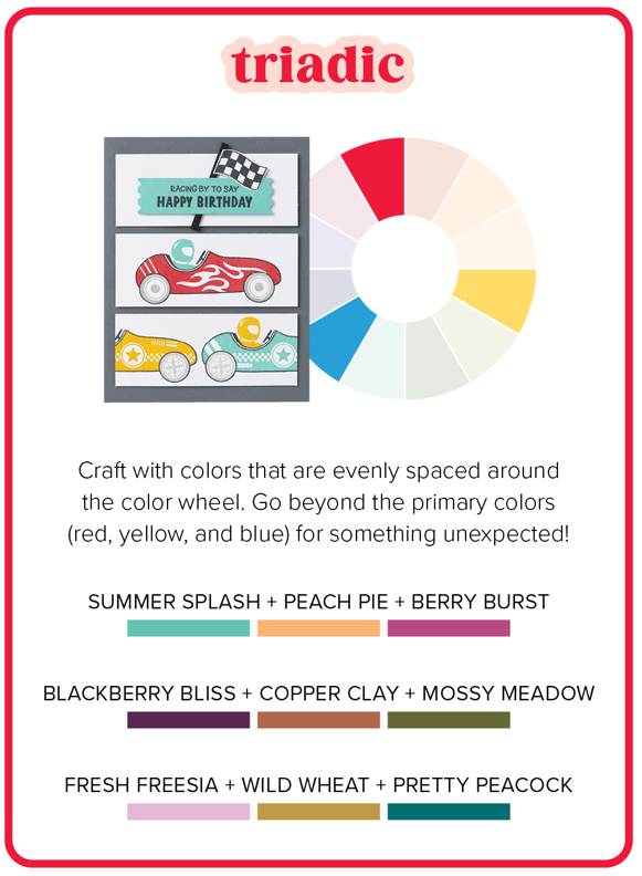
Triadic Colors
Triadic color schemes are found by finding three colors equally spaced apart on the color wheel. These color combinations can feel just as predictable (think the primary colors of red, yellow, and blue) as they do dynamic or unexpected. If you think of the color wheel as a dial, find a triadic color combination you like by shifting the dial one click at a time away from those primary hues. Then, it’s a good idea to pick a predominant color while letting the other two play important supporting roles in your card design.
Practical Tips for Color Coordinating Your Crafts
One of our favorite tips for color-coordinating in crafts is to look to nature. When in doubt, look at how colors appear in the natural world—it’s hard to go wrong by applying this advice to a craft project. You may be surprised to see how often the color combinations you come across on a walk or while looking through outdoor vacation photos align with what you’ve learned about color theory and the color wheel so far.
Take, for example, the lilacs that bloom in the springtime. The naturally occurring fuschia shades are directly across the wheel from the color found in their bright green leaves! Try this with other flowers, vistas, and even animals—you’ll soon understand why so many artists love and find inspiration in the great outdoors.
Another simple trick for how to coordinate colors in crafting is to look for inspiration online. Plenty of crafters and artists love to share their work and we get to benefit from it. A quick search for pretty color combinations on Pinterest or checking out relevant hashtags on Instagram can give you tons of color inspiration for scrapbooking and cardmaking.
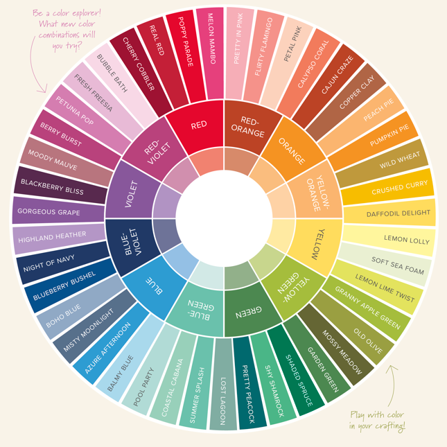
Our last, and maybe most helpful, hack for coordinating colors in crafting is to use the color wheel created by Stampin’ Up! for this exact purpose. Think of it as a cheat sheet that reveals innumerable color combinations that perfectly align with the products you already own or can easily shop for after falling in love with a particular palette. Incorporating all our color collections—Brights, Neutrals, Regals, and Subtles—the Stampin’ Up! color wheel follows the same rules as the original but with more dynamic and plentiful results.
Explore it using the rules you learned about monochromatic, analogous, complementary, and triadic colors to find unexpected new color combinations for your next crafting project!
Crafting with Color: Best Practices and Combinations
Stampin’ Up! has made it super easy to use best practices when it comes to color coordination in crafting. Because the best color combinations in scrapbooking follow color theory guidelines, we have created color families that perfectly coordinate no matter the occasion.
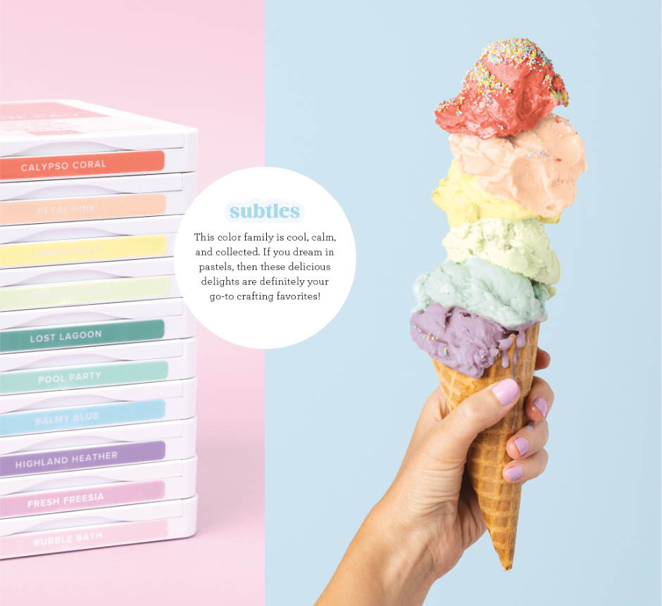
Consider our Subtles line—it’s a combination of calming colors that still breathe a little life and joy into whatever sentiment you want to capture in your project.
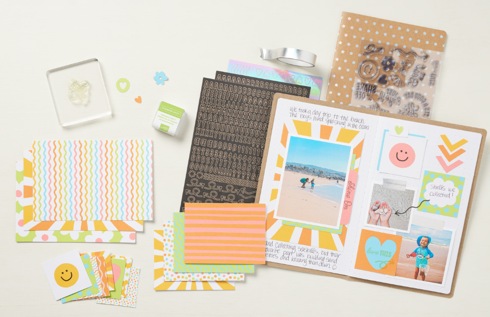
Utilizing Step-by-Step Stampin’ Up! kits is another great way to produce a variety of crafts and scrapbooking projects with purposefully complementary elements every time. This is a great option for beginners who don’t yet feel confident in their ability to find the best color combos or for the busy maker who enjoys the convenience of well-thought-out supplies and materials. This Love This Memory Notebook Kit is a great example!
Our best advice when it comes to crafting with color? Experiment! Playing around with color combinations that speak to you or whoever else you may be creating for is one of the best parts of the creative process. This often leads to the production of unique and heartfelt creations that wouldn’t exist without the joy of your own discovery.
Frequently Asked Questions: Color Coordinating in Crafts and Scrapbooking
Still have a few questions about color theory and color coordination in crafting? You’re not alone! Check out the quick and easy answers to some of the most frequently asked questions on the subject.
Q: What is color theory, and why is it important in crafting?
A: Color theory is the study of how colors work together and how they affect the people who experience them. It’s important in crafting because color is a communication tool—a critical and unique part of the story you’re telling in any crafting or scrapbooking project!
Q: How do I choose a color palette for my scrapbooking project?
A: Choosing a color palette for your scrapbooking project can be fairly simple. First, look at the photos you want to include on the page and consider the colors in those images. Then, ask yourself what your project’s overall message is. Next, find a main color that supports that message and works well with your photos. Third, use the color wheel and the techniques laid out above to choose a palette to support it!
Q: What are the best color combinations for making handmade cards?
A: The best color combinations follow the color theory guidelines we’ve discussed above, and best express the message you’re trying to send. Finding monochromatic, analogous, complementary, or triadic colors that speak to you and the receiver of your handmade card will always make your card design a hit!
Q: How can I effectively mix and match colors in DIY crafting kits?
A: Most DIY crafting kits, like the ones you’ll find at Stampin’ Up!, are designed to contain elements within a particular color family or palette already, making it incredibly easy to mix and match the supplies provided within. One tip, however, is to go back to what you learned about the color wheel. For example, if you have a ribbon from a separate kit that will work nicely in a monochromatic, analogous, complementary, or triadic way, don’t be afraid to bring it into the mix!
Q: What are some general tips for coordinating colors in handmade projects?
A: General tips for coordinating colors in handmade projects include using the four color schemes we learned about above. A simple starting point is to choose a color you love and then find other elements (paper, ink, markers, ribbons, etc.) of the same color but of varying saturation—thus creating a monochromatic color palette for your project.
Q: Where can I find color inspiration for my next crafting project?
A: Inspiration can come from many places, but we love seeking inspiration from nature—especially when it comes to finding the best color combinations. It’s also smart to look at the work of experienced crafters (try finding talented cardmakers who create in a style you enjoy on Instagram, for instance) and the professionals. Check out the Stampin’ Up! annual catalog and our Instagram or Pinterest account for plenty of color inspiration as well.
Q: What quick and easy color combinations work well in crafts?
A: Quick and easy color combinations are plentiful! Here are a few we love and that work for any number of crafts, occasions, or moods!
- Turquoise + peach + violet
- Fuschia + yellow-green
- Bright red + hot pink
- Royal blue + golden yellow
- Yellow + pink + green
Be sure to refer to our Stampin’ Up! color wheel for more color combos.
Get Creative With Color Coordinating in Crafts
Now that we’ve simplified color theory and color coordination in crafts, it’s time for you to get creative! What color combinations are you excited to try? Still looking for more card design inspiration? Ready to shop for perfectly coordinated colors of paper, ink, and other scrapbooking supplies? Shop or connect with a Stampin’ Up! Demonstrator today!
Not all products may be available. Please contact a demonstrator for additional options.